Vinomofo Black Market - Re-design

Design and Art Direction for the re-design of Vinomofo’s ‘Black Market’.
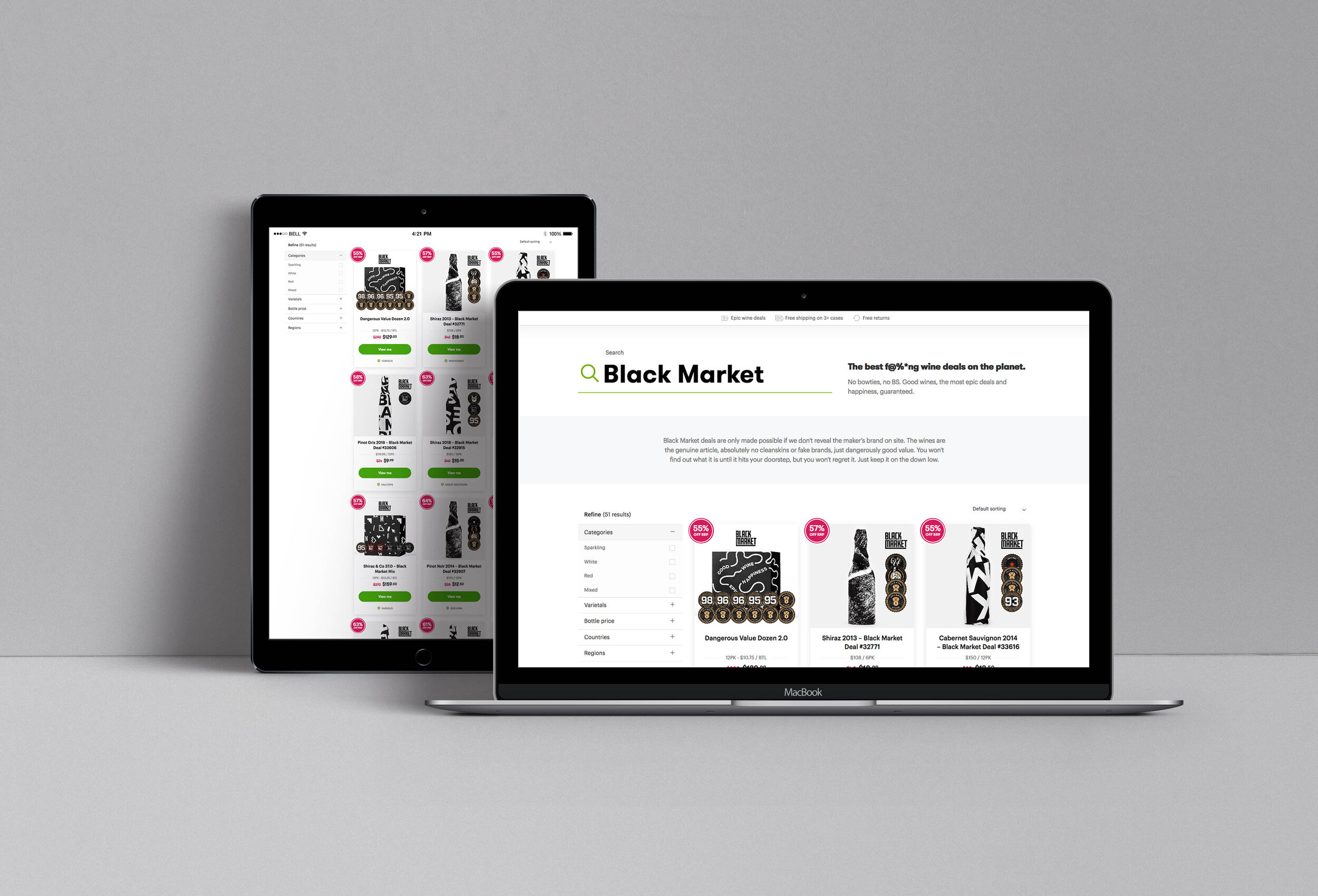
The brief: I was briefed to re-design the identity for Black Market, Vinomofo’s largest sub brand. Black Market consists of secret deals, all wrapped in paper to hide what wine it is. The previous design was all black and created using the same image, making a bad user experience since most deals on the site will then all look the same. Vinomofo wanted to keep the look black and white and all bottles wrapped.
The solution: The re-design is built on 30 different pattern designs. These are applied on boxes and tissue paper. Red wines are paired with a black design and white wines are represented with brighter papers. This has created a more dynamic and interesting look for the whole website, making it easier for the customer to navigate. A social campaign was also created, with the goal to create brand awareness and trust for the Black Market.
The logo: I wanted the new logo to express trust, confidence and a modern look and feel. The logo has been created as a wordmark and a symbol for flexibility.


“Black Market deals are only made possible if we don't reveal the maker's brand on site. The wines are the genuine article, absolutely no cleanskins or fake brands, just dangerously good value. You won't find out what it is until it hits your doorstep, but you won't regret it. Just keep it on the down low.” - Vinomofo


